The "Biodemocracy" book cover designed by Anna-Karin Ericsson
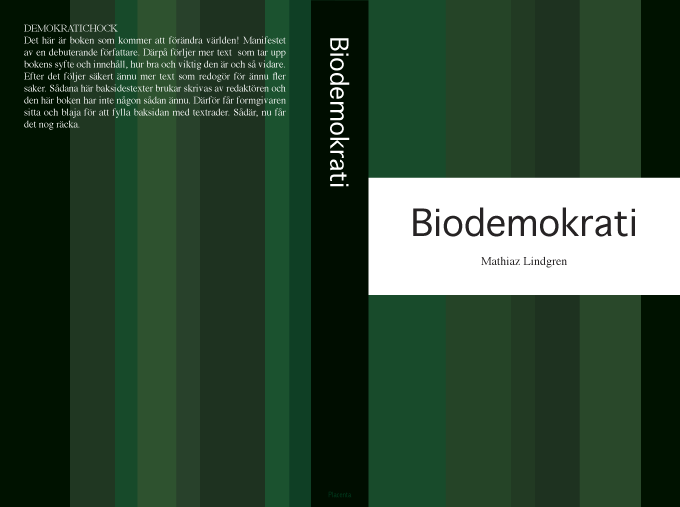
The author asked for a pure and correct cover “like a Bible or something...”. In his opinion green was the best choice of colour because it connects to the field of environment/biology. In a political point of view it’s also rather neutral.
First I imagined the cover filled up with green blades of grass, but in the end these blades were transformed into green stripes. The white and black colours strengthen the clarity of the green fields and bring the title more in focus. First I tried different colours for the stripes but later on I chosed some green tunes which I think make the cover more sophisticated. Asymmetri is quite important, otherwise the stripes would look dull and heavy, and the impression would lose its living appearance.
I think books are a bit like accessories, the back of the book must look good together with other books in the bookshelf, and the book must look attractive on the coffee table”.
Inga kommentarer:
Skicka en kommentar